Sunday, April 28, 2024

Exploring Ukiyo-e: Dive into the World of Japanese Art


Famous Sights of Nikkō: Hannya and Hōtō Waterfalls By Yōshū Chikanobu, 1981

Exploring Ukiyo-e: Dive into the world of Japanese Art

I am really excited about today's blog. Being able to choose a country and their artwork was fun. I am choosing Japanese Artwork from the Ukiyo-e period. My daughter is doing her Sophomore year in Japan through the student exchange program that UAF offers. Japan has been so good to her and they have such a beautiful country I thought I would showcase a peek into their artwork. Ukiyo-e means pictures of the floating world. The Ukiyo-e was established during the Edo period and was cherished as a form of mass entertainment by common people across Edo (present-day Tokyo). Its origin can be traced back to around the late 17th century. In this art style, we see a play of black and white contrasts that embody a sense of freedom reminiscent of a peaceful and uneventful era spanning about 260 years. What's captivating about this particular style is its ability to vividly portray the simple yet beautiful everyday life of the carefree common folk in Japan during the Edo period. 

History

This Artwork is titled Takiyasha the Witch and the Skeleton Specter. It is from the Edo Period and was created by Utagawa Kuniyoshi from c. 1843 to 1847. It is located in the Honolulu Museum of Art in the United States. In the backstory of this piece, we learn about Princess Takiyasha. She was the daughter of warlord Taira Masakado. Taira Masakado led a rebellion against the court in Kyoto, but unfortunately, the rebellion was unsuccessful, leading to Masakado's demise. Following his death, the spirits of the soldiers who fought in rebellion haunted Masakado's palace at Soma. 

Analysis

In this artwork we see the princess on the left, standing in the middle of some broken blinds. She holds a scroll. Looking at it I can really appreciate the imagination of the Japanese artist for the time. Pushing the boundaries is crucial for an artist to establish themselves. Utagawa Kuniyoshi, a Japanese Artist, is a perfect example of someone who built their career pushing those boundaries. He used his work to comment on and protest against the Japanese government at the time. He brings a sense of drama and horror into this work. Instead of showing a peaceful traditional Ukiyo-e setting in this piece, Utagawa takes the dramatic setting of the fortress and applies his mastery over a more whimsical art style. The action of the skeleton crawling brings a scene of chaos and dysfunction. Kuniyoshi, through this technique, can show both one story and yet 3 individual stories at the same time. Each panel also has a story. This art has a lot of black and white and then it uses color to bring your eyes to certain parts of the art. It definitely can bring different emotions depending on how you view it. This is an interesting piece and I think it would be a neat one to have in a living room. 

History
This piece is called Russo-Japanese Naval Battle at the Entrance of Inchon: The Great Victory of the Japanese Navy BANZAI! This artwork was made by Kobayashi Kiyochika in 1904. It is kept at the Museum of Fine Arts, in Boston, Massachusetts. This art shows activities from the battlefront of a war. But they also acted as propaganda, encouraging support for the wars and bringing with them patriotism. 
Analysis
In this artwork it emphasizes the bravery and success of the army and navy, using dramatic designs and bold compositions. I like the use of black and white and color red to show off the fire from the ships. It makes the pictures more dramatic bringing out those emotions of war. Then with the blue from the sailors bring your eyes to their excitement. 

History
This painting has a couple different names in different prints, but 
this is called Lovers in the Snow Beneath Umbrella (Crow and Heron) and is done by Suzuki Harunobu in 1764-1772 in the Edo period. It is kept in the Brooklyn Museum in New York City. It is a woodblock color print with the dimensions 67.5 x 12.4cm (26.5 x 4.8 in) 
Analysis
This piece has a stillness to the scene that perfectly captures the traditional Japanese aesthetic ideal of wabi. In Japanese art, Wabi is a quality of austere and serene beauty that really tries to express the mood of spiritual solitude recognized in Zen Buddhist philosophy. It has an appreciation for the quiet beauty of an unscripted moment captured in time. I really like the contrast between the young lovers. One black and one white, almost make me think that they are from different walks of life or status. But they have fallen in love. Something we all cherish. Harunobu captures the scene of a couple under an umbrella in a snowscape that shows the meaning of young love, the total identification of oneself with one's beloved. Contradictions of male and female, black and white have been subsumed under a greater idealized harmony. Showing one of the seasons, winter which is usually used for old age and death. Spring would have been more of a natural picture for love with flowers and things coming to life. This is something that I might even buy a print of for my daughter when she goes back to Japan to live. 

History
The artwork I chose is still from the Ukiyo-e Era but from later on in 1859. The Print artist is Utagawa Hiroshige II. The title is Nagasaki, The View of Maruyama. It is in a series titled: One Hundred Famous Views in the Various Provinces. Size is 36 x 23.9 cm. It is an Original Japanese woodblock print. 
Analysis
Here in this print, we see two women, they likely represent sex workers, they are in the foreground wearing classical, patterned robes. The background is positioned higher up to try and show that it is farther away. However western influences can be seen in the single-point perspective in the shapes of the building, it also has sloping lines of the porch and roof demonstrating a new stylistic development in the Ukiyo-e history.
Last Thoughts
All of the artworks that I chose are from the Ukiyo-e. The artworks are also all woodblock prints which are neat and hugely popular in to Edo period. Ukiyo-e is the name given to paintings and prints primarily depicting the transitory world of the licensed pleasure quarters, the theater and pleasure quarters, and the theater and pleasure quarters of Edo, present-day Tokyo, Japan. It is a composite term of uki (floating), yo (world), and e (pictures). All these artworks are neat on their own. Each shows different parts of the Japanese culture and brings different emotions. They are all really neat and if I had a Japanese room (which I might someday) I would love to get some of these prints and hang them up. The Japanese culture is much different from that of America and Europe. When new trade agreements beginning in the 1850s resulted in an unprecedented flow of goods and travelers between the West and Japan. Western appreciation for Japanese graphic art and objects quickly intensified and Japanese-influenced style irrevocably entered the lexicon of Western artistic expression. But yet at the same time, exposure to the West influenced Japanese artists and audiences. Trade was a big factor in different countries getting to experience other cultures and what those countries have to offer not just in food and goods but artwork too. The world wouldn't be what it is without all the mixings of these cultures and experiences that people have. Such a beautiful thing to experience. 

“Suzuki Harunobu: Young Lovers Walking Together under an Umbrella in a Snow Storm (Crow and Heron): Japan: Edo Period (1615–1868).” The Metropolitan Museum of Art, www.metmuseum.org/art/collection/search/45086. Accessed 25 Apr. 2024.

“Fuji Arts.” Fuji Arts Japanese Prints - Russo-Japanese Naval Battle at the Entrance of Inchon: The Great Victory of the Japanese Navy--Banzai!, 1904 by Kiyochika (1847 - 1915), www.fujiarts.com/meiji-era-japanese-prints/kiyochika/912114-russo-japanese-naval-battle-at-the-entrance-of-inchon-the-great-victory-of-the-japanese-navy-banzai-1904. Accessed 25 Apr. 2024

清親, Kobayashi Kiyochika. “Naval Battle at the Entrance of Inchon.” Obelisk Art History, 1 Jan. 1970, www.arthistoryproject.com/artists/kobayashi-kiyochika/naval-battle-at-the-entrance-of-inchon/.

“View of Maruyama in Nagasaki: Utagawa Hiroshige II: V&A Explore the Collections.” Victoria and Albert Museum: Explore the Collections, Victoria and Albert Art Museum, collections.vam.ac.uk/item/O421027/view-of-maruyama-in-nagasaki-woodblock-print-utagawa-hiroshige-ii/. Accessed 27 Apr. 2024.


Sunday, April 21, 2024

Breaking the Artistic Boundaries in the Postmodern Era


Breaking the Artistic Boundaries in the Postmodern Era
This week I will show you some art pieces from the Postmodern Era. I chose this one because this is when artists can choose to really push the boundaries of art. There is just something in me that says some boundaries need to be pushed and some don't, and I think this one does. And you'll find something beautiful happens. Postmodernism describes movements that both arise from and react against or reject, trends in modernism. It instead embraced experimentation with new media and art forms including but not limited to things like conceptual art, multimedia, and performance art. Several characteristics lend art to being postmodern. These things include the use of text prominently as the central artistic element, collage, appropriation, simplification, and performance art, then it goes on to also use the recycling of past styles and themes in kind of a modern-day context. Postmodern art refers to a style of contemporary art created from about mid-1900s onwards. This style is best understood by looking at what it sought to contradict,: the perceived traditional values and conservative point of view of the modern artists that were active in the years 1870-1970.

    
Titled Balloon Flower (red) 
History
This sculpture is made by Jeff Koons. He made five of them in different colors between 1995-2000. They ranged in colors blue, magenta, yellow, orange, and red. It sits at the World Trade Center site in New York City. It is made out of Stainless Steel. and weighs more than a ton and it stands over 10 feet tall. 
Analysis
These towering sculptures inspired by balloon animals are Koons most famous works of art to date. It is said that its shiny exterior is supposed to "seduce and manipulate." The surface of the Balloon Flower evokes the shininess of precious metals. Since it actually really is metal, its reflective, yet immaculate surface and perfectly concealed joints invite us to marvel at the symmetry and perfection of the objects. But when you walk up close to it, something neat happens. The overall composition fades, and you're confronted by his or her own distorted, imperfect image. How interesting and neat is that. I find this to be a really neat sculpture and would love to get up close to one. If they had small ones you could use for a shelf or desk I think it would be a neat conversation piece.  
Titled Temperance
History
This sculpture is by a French American artist Niki Saint Phalle. It is from her Nana series. This piece resides at the Tarot Garden, Southern Tuscany, Italy, and was made in 1987. The original statues she started out with mesh wire that she covered in paper mache then went on to make use of fabric and found objects and as more were created, Saint Phalle used polyester, ceramic, and other things to make the statues more curvaceous.

Analysis
Niki's Nana series of statues were originally inspired by a pregnant friend of Saint Phalle's Her Nana series are shaped into female sculptures in outrageously modern contortions and bright colors brought her some notarization. Niki also designed and created this fantasy garden in Tuscany with large colorful figures and shapes that were based on Tarot cards. This sculpture is a model of Temperance, card number 14. Interesting right? The full-size piece crowns the Chapel of Temperance in the garden in Italy. She definitely broke boundaries with her artistic sculptures. They're not concerned with the fortune-telling uses of the cards, but rather the elements of life's experience, personality, and self-knowledge they really refer to. These sculptures have lines that are curvy and well rounded all shapes that are a great representation of women. As a true feminist rebelling against the patriarchy and women's assigned role of homemakers, Niki de Saint Phalle created these models that represented a certain joy for life and liberty. They are eyeless and they are found in unexpected stances that show the real challenge to laws of anatomy, gravity, and weight. I think it would be neat to have one of her small sculptures in true nana form on a desk. I would love to see the big sculptures if I ever get the chance.
 Her "Nana" sculptures are designed to liberate women from the straightjacket of 1960s society.

Titled Hon
History
This sculpture is another one of Niki de Saint Phalle's. But this time she collaborated with Jean Tinguely and Per Olof Ultvedt. It was a temporary exhibit called Hon- en cathedral (She-a Cathedral) in 1966 at the Modern Art Museum in Stockholm, Sweden, which was devoted to creating a massive pregnant sculpture that people could come and interact with. It was 25m (82 ft) long and 9.1 m (30 ft) wide weighed in around 6 tons and took a team of 8 about 40 days to create.
Analysis
First off I think it would be really interesting and neat to go to an exhibit like this. This sculpture is a giant form of the female body from the waist down and it is lying down with knees up and feet planted. You can walk through the door-sized Vaginal opening between her legs. They had a milk bar that was in one breast, and they deposited waste down a chute into Tingley's formidable glass-breaking machine below. Which kind of feels like it was something of a digestive system. A goldfish pond occupied the area of the womb. Ultvedts heart was not simply a flapping, rocking, pumping shape, but a man could be found in HON's heart. They also had a brain with mechanical parts by Jean Tingley. With this artwork, Saint Phalle reclaimed the woman's body as a site of tactile pleasure rather than just an object of voyeuristic viewing. Hon was both, a colorful yet playful homage to woman as nurturer and a potent demythologizer of male romantic of the female body, as an unknown content and unknowable reality. Niki de Saint Phalle often presented images of women that ran counter to formalist aesthetics of the Pop art era, when all we had were pin-ups and slick nudes. They used bright colors on the outside and inside all in black. Very contrasting. They used the curvaceous shapes of women on the outside. I think all these illusions were intentional. HON transformed a very random idea occurring on the inside into something new, giving it a meaning that it would never have had on the outside of the sculpture. This one makes me giggle and I would never want it in my house but would love to visit one. Breaking that artistic norms and boundaries yet again!

Titled Fillette (Sweeter Version) 
History
This was made by Louise Bourgeois and American French artist. Its size is 59.7 x 26.7 x 19.7 cm. It is made out of latex over plaster. It is in the Estate of Peter Moore, Museum of Modern Art, New York. 

Analysis
In the late 1960s and 1970s, many American women artists were drawing on images from the body. As people enter the 20th century, vaginal shapes become three dimensional, rising up from their surface in ways some have actually found quite beautiful, others essentialist and reductive, and still others threatening. The human body is a natural part of life. Why not put it on display since it is a beautiful thing? Bourgeois has certainly used female sexuality in her works, but by the 1960s she was more androgynous or maybe even masculine in her choices of subject. Her most famous and most photographed "erotic" work is her latex sculpture Fillette 1968, which playfully confuses genders. She combined her themes of confinement, power, and sexuality in a series of cages, or cells. This piece Bourgeois achieved a fleshy, tactile texture in this hanging sculpture. Well, you guessed it, it obviously is a phallus, but if you look at it, it can also be in the shape of a female torso. The two round forms are the tops of two legs, attaching to their hip joints. This molding of genders creates ambiguity, as do the work's dual qualities of erect potency and fragile vulnerability. "From a sexual point of view," Bourgeois said, "I consider the masculine attributes to be very delicate."(Louise Bourgeois) I find this art neat, and would love to see it in a museum, but not at home.

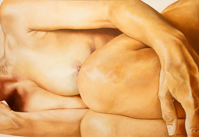
Titled Cacoon
History
This artwork was painted by Christina Michalopoulou and was painted in oil on canvas. It is 27.5" x 39.4". It comes from the "Selfie" series and was included in the "HerStory" exhibition. 
Analysis
Michalopoulou once said "I always try to narrate a story through the lines of a body, through a scar, a wounded skin, a sight or touch. At the beginning of every painting I fall in love with the story, the body, the skin, and the feeling, I get deep into it and when it comes to an end I always feel exhausted and empty. It's an addiction" (Phillips). She uses the female body to show her lines and it creates a different emotion depending on who you are I think. If you have curled up on the shower floor and laid there crying, this might hit you. If you lay there in bed but love to curl up you would get a different emotion. Myn is just the safety I feel when I am curled into this position brings good emotions. This piece would be cool to put over my bed at home.


Titled Torn and Twisted Curtain
History
This piece was made by Joseph Havel in the years 2004-2005. Its top corners are spread to 16 feet wide but the overall dimensions are w61 x h 487.7 x d 71.1 cm. It is balanced on a knotted foot of curtain. Its medium is Bronze with Patina. Between 1996-2006 Havel made 30 sculptures that were made from cloth and cast in bronze. 
Analysis
I am finishing out my post-modern blog with this piece. Who would of thought with a piece of cloth you could make artwork that would inspire others. He took something as simple as a plain boring sheet and made something extraordinary. This piece is almost motionless and appears to be floating in space with no gravity. This piece has different textures using cloth and bronze. The lines in it are wonky and definitely don't have those neat lines or curvy ones of some of the other sculptures. It almost looks as if you have just pulled some sheets out of the dryer and they are all bound up and you have to twist them out of a ball. That is what this feels like. Something all tied up and twisted into a knot. I wouldn't want this piece in my house. But this piece really shows he was thinking outside the regular norms of modern art. 

Throughout history, art has served as a powerful tool for self-expression and social commentary. From the earliest cave paintings to modern-day sculptures and masterpieces, individuals have went on to use art to make statements about the world and their place in it. It is fascinating to dig deeper into it and see how it changes throughout the years. I hope you enjoyed my blog today. Thank you for reading it and commenting.


Resources
Deng, Connie. "Niki de Saint Phalle". Encyclopedia Britannica, 25 Oct.     2023, https://www.britannica.com/biography/Niki-de-Saint-Phalle. Accessed    April 2024.

“Visualizing Birth and Rebirth in Niki de Saint Phalle’s ‘Hon – En Katedral’ (‘she – a Cathedral’).” Visualizing Birth, 21 July 2023, visualizingbirth.org/visualizing-birth-and-rebirth-in-niki-de-saint-phalles-hon-en-katedral-she-a-cathedral. 

“Fillette [Louise Bourgeois].” Sartle, 30 Aug. 2022, www.sartle.com/artwork/fillette-louise-bourgeois#:~:text=Bourgeois%20herself%20said%2C%20%E2%80%9CFrom%20a,torso%20with%20a%20severed%20head.

Phillips, Renee. “Home.” Manhattan Arts International, manhattanarts.com/interview-with-artist-christina-michalopoulou/. Accessed 15 Apr. 2024.

Saturday, April 6, 2024

Early Modern Era

The Rise of African American Art in the Early Modern Era 


After the end of the Civil War, many things changed in the arts. There were so many political changes and growths at this time, one of which can be considered one of the most influential developments in art in the Early Modern Era. This of course is actually The Harlem Renaissance and the influence of the African-American culture along with the community during this time period. It turned out to be very influential. African American artists have used art to preserve community memory and history as well as empower so many cultural movements of the time like Harlem Renaissance, hip-hop, and Black Arts just to name a few.


History
This Artwork is by Henry O Tanner and he painted it with oil on canvas. It is called One really neat part, Tanner did was he actually mixed sand into his pigments to emulate the texture. The sand dunes are constructed with a bold sweep of windblown beach bordered by the sand dunes,  The landscape was the first painting created by an African American to be part of the permanent White House collection. 


Analysis
This painting's view is something you would see far away from beaches where people sit on the beach and there are crowds. To me, it's like someone is on a walk headed to the water's edge. He has painted some scrubby vegetation you see that grows in clumps of seagrass that you find on a beach. The sun tries to peak out with a rosy glow, and you can almost feel the wind on your face from this painting. If you have ever been to a beach on a windy day you know what I mean. Tanner's painting is strikingly original. It has a serenity like other landscape artists of the time have. Elements of composition and tonal expression, from the broad bands of shadow, the cupped landscape to the hazy moon can be found in this painting. 


.


History
This artwork was painted with oil on canvas in 1934 by Aaron Douglas. It is titled From Slavery through Reconstruction. There are four paintings in this collection of murals, the collection is called Aspects of Negro Life. They are displayed at the New York Public Library. I think his paintings show a lot of the emotion going on through the African American community at the time. They show this desire to change how the African-American people's history was perceived by the public. And it is a powerful message.


Analysis

Douglas's style gives this wonderful layered look. Can this represent something? Maybe the layers of their past, or history? He uses many different symbols that are actually important to historical changes. One of my big questions is why he uses shadows, it gives me the impression that he is trying to represent many people in the community. They aren't grouped into one style or characteristic. There is both flatness and depth to it. The characters are silhouetted and layered on this vibrant background that is made of neat geometric looking shapes in earthy tones. It seems like there should be some movement in the painting. His style is abstract, showing the changes and progression that the people had toward freedom during those hard times. 


My thoughts

I have fallen in love with the artwork and styles that came out during the late 180''s and even into the early 1900's. This is when people really start to get a voice and speak out, express themselves, and really take charge of the times and they show this through their artwork. You can really tell what goes on during a period in history by looking at the artwork of that time. During the Early Modern Era, African Americans have a monumental impact on the visual arts being produced at that time. It was the first time in history and a start to the artistic world in which the African-American culture was actually the center of subject matter and they were being painted in a new light. Their culture was able to be expressed through artwork at the time in beautiful and unique ways. One beautiful thing I found was that I really enjoyed seeing how African-American art was finally able to be appreciated but also accepted. What a neat change in the American Art of the time to see. Depending on the artist you see different ways they were inspired, and the different perspectives they have of their period. Both of these paintings are beautiful and unique in their own ways. 


“Aspects of Negro Life: From Slavery to Reconstruction, 1934, by Aaron Douglas.” *Aspects of Negro Life: From Slavery to Reconstruction*, 1934, by Aaron Douglas. | DPLA, dp.la/primary-source-sets/social-realism/sources/676. Accessed 1 Apr. 2024.


“Sand Dunes at Sunset, Atlantic City by Henry Ossawa Tanner.” WHHA (En-US), www.whitehousehistory.org/photos/sand-dunes-at-sunset-atlantic-city-by-henry-ossawa-tanner#:~:text=Henry%20Ossawa%20Tanner-,Sand%20Dunes%20at%20Sunset%2C%20Atlantic%20City%20by%20Henry%20Ossawa%20Tanner,the%20character%20of%20its%20artist. Accessed 1 Apr. 2024.

Thursday, March 28, 2024

Romantic Era

 Art Nouveau and Realist


Art Nouveau

I have chosen to do my comparison with Art Nouveau and Realist. I find something interesting in the Art Nouveau Artworks where Realist I am not too fond of. 

My first two pieces will be from Gustav Klimt. I have chosen him for his unique style. After almost dieing myself both of these paintings bring to me important things. Death, the circle of life, and making it through the stages of life. 


This painting Is called Death and Life by Gustav Klimt in 1910/1911 a couple years before the world was set on fire by the Great War. This painting is kept in the Leopold Museum. This painting brings something we all think about death. The painting on the left is very dark a skeleton armed with a club that is approaching the people holding onto themselves while almost grinning, waiting for them to open their eyes. 

On the right side is life. It has naked body parts that alternate with beautiful almost quilt-like colored decoration or ornamation. Every age group is represented.  There is a mother with her young child, a pair of lovers, and an old woman. Which shows a symbolism of life. They lay there and don't open their eyes while death is near. Like to ignore it. But also like they are looking within. For strength? Bond of each other holding them together? Or accepting their fate? Death might be able to come in and take life itself, but humanity as a whole though will always be able to elude his grasp. The contrast provides the impression that the presented characters in the painting are good and bad. Now this painting definitely brings out the deep emotions I have when thinking that death is always knocking at the door waiting for your time. 


This stunning painting is called The Three Stages of Woman and was painted by Gustav Klimt in 1905 with oil on canvas. Klimt's vision is rooted in the relationship between erotic power and the fatality of death. To me, there is something elegant in this painting. It brings the cycle of life. There is three figures in three different stages of life. The woman on the left looks very realistic and kind of expressive style. It is very different in contrast to the other two figures and backgrounds. The old age of the woman on the left is portrayed with beautiful accuracy and with careful detail. She stands with her head bowed and seems ready for her fate. Yet beside her is a young woman wrapped in a veil, you can tell she is happy from her face and maybe joyful of her age and life. She looks like a seductive woman. She looks like a young mother in her prime. She is heavily stylized with wavy hair and curvy soft shapes and strong contours of her body. Yet in her arms is a sleeping baby. Who looks much like her beautiful mother and seems happy, the mother supports her young child in a loving embrace. The background is dark and black, which is rare in Klimt's works. There is also a little gold and bronze./ The ornamental motifs around the two figures have different qualities. They reinforce the conflict one has between old age and death, represented by dark spots and the youth and child characterized by softer and delicate colors. There is light and dark in the background. The decorative circles are reminiscent of cells, maybe it could be an ova, but for sure it's a representative symbol of life and energy, while the black brings with it death. This brings out an emotional feeling of life and to not take if for granted.

I feel Gustav Klimt's message with his works is trying to light the cycle of life. We all come into life naked, we die naked and we all go through it and each stage has its own beauty.


Realist


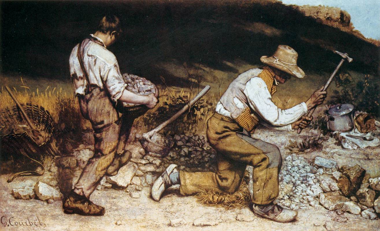
The Stone Breakers, 1849 by Gustave Courbet


This painting is called The Stone Breakers by Gustave Courbet. It was painted in 1849. Unlike my first two paintings which don't look realistic this painting Courbet wanted to show what was "real", so he painted two men doing real men's work. His Stonebreakers represented workers, as he had seen them, in monumental form.  Realism was a broad cultural movement in the 19th century that had its origin in literature and philosophy. In painting, its most prominent representative was actually Gustave Courbet. This painting it shows one man too old for back-breaking hard labor and one too young, which in turn shows the hardship and the exhaustion that the men endured at the time. Courbet made use of great line work, color, and composition but his brushwork is a little rough in this painting. This brings on the emotions of hardships and I feel that these guys are a slave to their work. 

The Stonebreakers was actually destroyed during the bombing of Dresden in 1945, and was one of his best works. 


The Woman in the Waves

This painting is called Woman in Waves by French realism painter Gustave Courbet in 1868. It is painted in oil on canvas 25 3/4 in x 21 1/4 in. It is now stored in the Metropolitan Museum of Art in New York. This painting is very realistic and you can see the different tones of her skin and the underarm hair. Between 1864 and 1868 Courbet took on a series of female nude paintings. This was actually painted at Pont-Aven in Northwest France, she seems to be throwing herself into the sea which at the time is a metaphor for a modern European woman who is forsaking civilization and going to abandon herself to the most natural instinct, primal. Courbet is considered a Symbolist. He makes sure to use soft color tones and curvy and gentle lines. This makes me feel very feminine and that you should always feel good in your skin. This would be a neat one to have in the bedroom at home. 

I think the message Gustave Courbet is trying to say is his art insists on the physical reality of things that he has observed and wants to bring them to light. Like the two men old and young still a slaves to their work in both stages of life. He wants to bring out the truth to his paintings.


Death and Life, 1908 by Gustav Klimt, www.gustav-klimt.com/Death-And-Life.jsp. Accessed 26 Mar. 2024.


Thursday, March 21, 2024

The Morality and the Art of the Classical Era

Today I have chosen to do my blog on The Morality and the Art of the Classical Era. What does this mean? What does this represent? Well follow along and I'll share with you my view as I see it.

Art throughout the 18th century made major changes. They were on their way to braking from tradition. This was called the Enlightenment period and artists and critics were emboldened to demand greater naturalism or realism in art, in style and subject matter. They gave up ideals of perfect balance, unity and harmony and moved on to focus more on showing drama, and lots of emotion. In the Classical Era, we are going to talk about two types of art. The Rocco and the Neoclassical which was the anti-rococo. Both are different, yet so very important. Through the artwork that I am showing you today, we will see different types of morality. And how the painter shows you this through their artwork. 

Morality is shown in different ways throughout. But in the Rococo period which came first, it wasn't popular. When it came to the neoclassical era it played a huge part in their artwork. This is one of the biggest differences between both of these styles. The Rococo style originated in Paris, France in the early 18th century. But not long later it was adopted throughout France and later in other countries. Neoclassical originated in Rome, a much different culture and country in the mid-18th century. Based on the ancient Greek and Roman models.

Rococo style shows scenes of love, nature, youthfulness, lightness, and elegance while there might be some drama. French ideals. Many of the artworks in this period show aristocratic women out in the forest or meadows enjoying different activities. The visual arts within the Rococo period went beyond interior decoration and this style of the period shows in the paintings and sculptures.

The first piece I have chosen is considered to be one of the masterpieces in the Rococo period. I think it is a great symbol of the period. 

History

This is an oil painting painting is called The Swing or Happy Accidents on the Swing by a French artist named Jean-Honoré Fragonard. The Baron, Saint-Julien wanted to have a painting made of him with his mistress. It was painted in London, United Kingdom in 1767. It is displayed in the Wallace Collection at the Hertford House, Manchester Square London.

Analysis

This is a typical Rococo setting, showing something peaceful, an outdoor setting with trees and some brush showing the happiness of the aristocrats. I want you to look at this picture. She is on a swing and is being flirtatious, and mischievous while she throws her shoe off toward her lover. While he is in the bushes, he looks like he is looking right up at her dress, at her legs? Or something more? Did this shock him so he fell into the bushes? Do you see the sculpture up in the top left? A Putto, which is known as a symbol of love, has his finger to his lips, telling us to shhh. Inviting the spectator into their secret? What about the guy on the bottom left in the dark? The Swing is a symbol of sexuality and erotic love. It also depicts individual freedom to me as she is on the swing. Frogard draws us in with the visual humor, double entendre, and loaded symbols that reward you if you choose to look closely. The lighting in the artwork is coming from the upper left-hand corner and comes down to the woman making me think it is trying to show light on her. Some diagonals help to direct the focus in a baroque style though that leads into the Rococo style. This painting shows some themes from the movement like the power and influence of the aristocracy, pastel colors that have a painterly style, lingering Baroque characteristics, shows sexual, mischievous love. These are themes that are usually spread out. But it is neat to see them all here too. This is an interesting painting and brings some interesting emotions but I wouldn't want it in my house. 

The second piece I've chosen stunning piece of artwork is called Oath of the Haratii and was painted by Jacques-Louis David.


History
 It was painted with oil on canvas in 1784 and is 3.3 x 4.25m in size. It is on display at the Louvre in Paris, France. The story of Oath of the Haratii came from a Roman legond came from a group of Romans and a rival group from a town not to far away called Alba. During this time they didn't want a war so they elected some representatives to find a solution. The Romans select Haratii and Albans choose three brothers. In the painting, it shows Haratii taking an oath to protect Rome.

Analysis

This painting was a royal commission and was manifested for the new style, neoclassicism. Look at the artwork, you can see patriotism, action, reason, and some self-sacrifice. While I look at it it gives me intense emotion. You feel what this guy is getting ready to do. Pay the ultimate price to his people and country. Something that hits close to home for me. As my husband spent a year and a half in Bagdad and Mozul for the Iraq War. I feel that this painting is a perfect example of how neoclassical paintings were meant to bring a spark to the people to do the right "moral" thing when it comes time. This type of artwork has yet to go away through the centuries. You can even see it today. Morality is shown through the years in different ways in artwork and other things. This also shows Greek and Roman influence through their attire. There is three elements in the picture. The father, sons and the women. The painting is split between the father holding the swords and the brothers and the women who are holding eachother since they resigned to their fate. But the focal point is the swords that old Horatius is about to give to his sons. David highlights enlightenment ideas with strong angular male features and passive curving features of the women.  It has strong, raking light, and has clear definitions of space to emphasize moral principles, unlike Rococo paintings. 

I think this painting is beautiful. I would love a copy of this in a living room. I love the patriotism and moral meanings in this painting. 

For my third choice, I have chosen Death of Socrates by a French painter Jacques Louis David. 


History

This artwork was painted in 1787 in oil on canvas and is 129.5 cm x 196.2 cm.  It's part of the neoclassical style. This is the only one of the three I've chosen that is displayed in the U.S. Its location is the Metropolitan Museum of Art, New York. Rather than a royal commission, David received a direct private commission for the work in 1787 from a wealthy Charles-Michel Trudaine de la Sabliére, the youngest of the Trudaine de Montigny and around 20 yrs old at the time. The story behind is Socrates has been convicted of going and corrupting the youth of Athens by introducing weird and strange gods, so they have sentenced him to die by drinking a drink that is poisoned with hemlock. So Socrates sees that he can use his death as a final lesson for his pupils instead of running away and fleeing when a chance comes along. 

Analysis

David uses color in this painting to bring out emotions and highlight them. For instance the color red is dimmed in the edges of the painting but vibrant in the center, which is the man holding the poison. The message is that it is noble and moral to stand up for one's own principles and beliefs. The painting is so dark overall but there is intense lighting that provides the main visual contrast. Socrates is painted with a white robe surrounded by his students and followers who show emotions of distress in the face of his possible death. His flesh and the robe are shown with light, which shows contrasting high value. There is horizontal and vertical placement of lines. There is a system of right angles on a grid structure that helps to enforce the rational decisions of Socrates's actions. Moralizing themes were again popular throughout this era. Socrates was given a choice to renounce his beliefs or take the poison and he chose to take the poison. This painting plays upon morality. Moralizing themes were immensely populor in the tumultuous period that preceded the French Revolution.

This is another interesting painting that brings out emotions in me again, and you just feel for Socrates. I think this would be something I might like a print of in an office or something like that. 


Rogers, and Gough Hartley. “Chapter 14: Rococo and Neoclassical Art.” Chapter 14: Rococo and Neoclassical Art, BYU Open Learning Network, 1 Jan. 1970, open.byu.edu/history_of_the_fine_arts_music/rococo_and_neoclassical_art. Accessed 18 Mar. 2024

Bruckbauer, Dr. Ashley. “Jean-Honoré Fragonard, the Swing.” Smarthistory, smarthistory.org/jean-honore-fragonard-the-swing/. Accessed 21 Mar. 2024.

“The Death of Socrates (Y1982-82).” Princeton University, The Trustees of Princeton University, artmuseum.princeton.edu/collections/objects/32792. Accessed 20 Mar. 2024.

Hale, Charlotte, and Silvia A. Centeno. “The Death of Socrates: New Discoveries.” The Metropolitan Museum of Art, 5 May 2022, www.metmuseum.org/perspectives/articles/2022/5/the-death-of-socrates-new-discoveries. Accessed 18 Mar. 2024

McCoy, Claire Black. “David, Oath of the Horatii (Article).” Khan Academy, Khan Academy, www.khanacademy.org/humanities/ap-art-history/later-europe-and-americas/enlightenment-revolution/a/david-oath-of-the-horatii. Accessed 19 Mar. 2024.

Thursday, February 29, 2024

The Renaissance a Baroque piece of Art


Artemisia Gentileschi's Judith Slaying Holofernes

For this assignment, I decided to go with something that shows a lot of emotion. This painting to me is a great example of Baroque Artwork. 

History
What is Baroque Art? Well, actually the term Baroque comes from the Portuguese 'barocco' meaning 'irregular stone or pearl', this refers to a beautiful cultural and art movement that went along to characterize Europe from as early as the seventeenth to mid-eighteenth century. To be Baroque is to show drama, movement, tension, vitality, emotions, and a tendency to go and blur the distinctions between certain art forms. This painting represents the human and professional tale of a woman who chose to be an artist in an era that was dominated by men. This piece of art was painted in 1620 by Artemisia Gentileschi and is called Judith Slaying Holofernes. It is housed in the Uffizi Gallery, in Florence, Italy. There are actually two versions. The first was created around 1611-1612. The second one (this painting) was painted later and thought to be commissioned by the Medici family. Gentileschi was the most accomplished female painter of the Italian Baroque. When she painted this Italy was in the middle of the Counter Reformation. During this time the Catholic Church had lost many followers to the Protestant faiths. So they did their best to damage control the situation to bring their people back. So they used art as a tool. The Baroque art wasn't just decorative, oh no, they used it as propaganda. Which go on to include things like good versus evil or artwork to show Christian and Jewish heroes conquering evil. The story behind this painting is given in the Book of Judith, which is shown in many different types of paintings and sculptures throughout this period. In the story, Judith is a beautiful widow, she enters the tent of Holofernes because he desires her. He was an Assyrian general who was about to destroy her home, the city of Bethulia. He passes out from a drink and is decapitated by Judith.

Analysis
When I saw this painting I knew this was the one to choose. I love Baroque! It is shocking but also captivating. I wanted to know why this was happening to make these women do this. Which brings me to the Baroque era. The emotions and the drama brought out in this painting are stunning. Look at the arms, and the position of the bodies, and do you see the diagonal lines that cross? I see it too, this also adds to the painting and the drama I think. The colors in this painting are vivid and the blood really adds to this painting and the fact that they are killing him. You know when there is blood spurting out, death usually comes with it. The fact that they have him underneath them also shows the women's power and drive to get this done. I also find it interesting that the sword is centered on the painting and in a cross shape. Her fist and sword are definitely placed there on purpose. It also has so much realism and detail in it. From their faces, and clothing all the way to her wrist that holds the sword. You can almost smell the blood as you look at it. 

This is a painting that would be really neat to get a closer look at. I would like to see all the versions of it too. This painting really has a place in a museum, art school, or something similar. If I had a print of this, it would be good to hang in an adult living room or something like that. Something without children around. I would like a print of it, but I don't know where I would put it. Such a beautiful masterpiece though.

“Artemisia Gentileschi, Judith Slaying Holofernes (Article).” Khan Academy, Khan Academy, www.khanacademy.org/humanities/renaissance-reformation/baroque-art1/baroque-italy/a/gentileschi-judith-slaying-holofernes. Accessed 29 Feb. 2024.


du Plessis, Alicia. “‘Judith Slaying Holofernes’ by Artemisia Gentileschi - an Analysis.” Art in Context, 20 Nov. 2023, artincontext.org/judith-slaying-holofernes-by-artemisia-gentileschi/. https://artincontext.org/judith-slaying-holofernes-by-artemisia-gentileschi/

Lyon, Howard. “A Baroque Composition.” Muddy Colors, 15 July 2020,         www.muddycolors.com/2013/12/a-baroque-composition/.


Exploring Ukiyo-e: Dive into the World of Japanese Art

Famous Sights of Nikkō: Hannya and Hōtō Waterfalls By Yōshū Chikanobu, 1981 Exploring Ukiyo-e: Dive into the world of Japanese Art I am real...